


CONTACT
Address
Phone & Fax
Online
Hager Companies 139 Victor Street Saint Louis, MO 63104
Toll Free: 800 325 9995 Headquarters: 314 772 4400
marketing@hagerco.com www.hagerco.com
HAGER COMPANIES
ONE FAMILY. ONE BRAND. ONE VISION.
ABOUT HAGER COMPANIES
I n an age where door hardware distributors, architects, contractors, end-users, and OEMs look for a partner they can trust, we at Hager Companies separate ourselves by providing a level of integrity, commitment, and customer service uncommon in our industry. As the only 6th generation, family-owned provider of door hardware and electronic access control products, we offer a full line of complementary door security and life safety goods and services that elevate the value our customers bring to their respective channels. We accomplish this by knowing the collaborative dynamics of the markets we serve, performing our jobs to the best of our abilities, and striving for constant development and enhancement of industry-leading skills and processes.
THE HAGER COMPANIES LOGO
IS THE MAIN ELEMENT IN OUR VISUAL IDENTITY, AND SHOULD ALWAYS BE INCLUDED IN ALL BRANDING CONTEXTS.
Rationale
Our logo was developed to be modern and future-proof. It is a distinctive mark and brand that seeks to present Hager as a forwardthinking, professional organization.
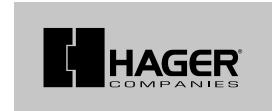
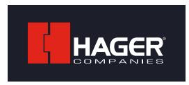
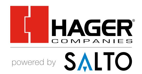
Approved Logo (PMS 485, Black)
Construction
The graphic element is a bold nod toward our roots in the door hardware industry.
The typographic element is designed to complement and enhance the logo graphic. Existing in harmony, it neither dominates or becomes insignificant.
Structure
Our logo is the key building block of our identity, the primary visual element that identifies us. The logo elements have a fixed relationship that should never be changed in any way.
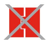
Do not alter the Hager Companies' logo in any way, including changing the colors, angle, or dimensions.
The Hager Companies' logo should always appear complete, with no elements missing or standing on their own (i.e. do not use the red Hager "H" on its own).
Unacceptable Variations
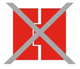
Do not reproduce in a tint or screen.
LOGO CLEARSPACE AND MINIMUM SIZES
It is important to keep the corporate marks clear of any other graphic elements. To regulate this, an exclusion zone has been established around the corporate mark. This exclusion zone indicates the closest any other graphic element or message can be positioned in relation to the mark of the symbol itself and the Hager name — they have a fixed relationship that should never be changed in any way.
CLEARSPACE
Definition
-
Whenever you use the logo, it should be surrounded with clear space to ensure its visibility and impact. No graphic elements of any kind should invade this zone.
Computation
-
An area of clear space should be maintained around the logo that is equal to or greater than the distance "X" as indicated in the diagram below.
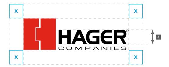
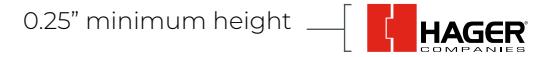
MINIMUM SIZES
The Hager logo must not be reproduced at a size smaller than 0.25" in height.
IDENTITY USAGE ON BACKGROUNDS
The following are acceptable ways of reproducing the Hager Companies' logo.
If the logo must appear against a black or dark background, use the 2-Color Reversed logo.
If using the Hager Companies' logo on a red background, use the Reversed White logo.

2-Color 2-Color Reversed
Black Reversed White
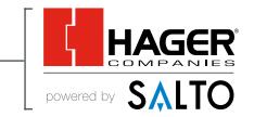
THE HAGER POWERED BY SALTO
BRAND EMBODIES OUR ONGOING PARTNERSHIP WITH SALTO IN DELIVERING EXCEPTIONAL ELECTRONIC ACCESS CONTROL SYSTEMS
Rationale
Our logo was developed to showcase the strong partnership between Hager Companies and SALTO Systems.
Structure
Our logo is the key building block of our identity, the primary visual element that identifies us. The logo elements have a fixed relationship that should never be changed in any way.
Do not alter the Hager powered by SALTO logo in any way, including changing the colors, angle, or dimensions.
The Hager powered by SALTO logo should always appear complete, with no elements missing or standing on their own (i.e. do not use the red Hager "H" on its own).
Approved Logo (PMS 485, Black, Process Blue)
Unacceptable Variations
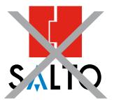
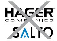
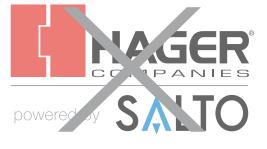
Do not reproduce in a tint or screen.
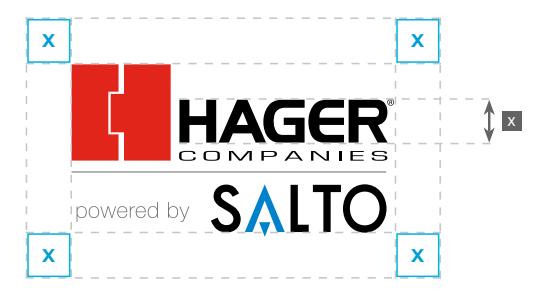
MINIMUM SIZES
The Hager powered by SALTO logo must not be reproduced at a size smaller than 0.5" in height.
0.5" minimum height
LOGO CLEARSPACE AND MINIMUM SIZES
It is important to keep the corporate marks clear of any other graphic elements. To regulate this, an exclusion zone has been established around the corporate mark. This exclusion zone indicates the closest any other graphic element or message can be positioned in relation to the mark of the symbol itself and the Hager name — they have a fixed relationship that should never be changed in any way.
CLEARSPACE
Definition
-
Whenever you use the logo, it should be surrounded with clear space to ensure its visibility and impact. No graphic elements of any kind should invade this zone.
Computation
-
An area of clear space should be maintained around the logo that is equal to or greater than the distance "X" as indicated in the diagram below.
IDENTITY USAGE ON BACKGROUNDS
The following are acceptable ways of reproducing the Hager powered by SALTO logo.
If the logo must appear against a black or dark background, use the 2-Color Reversed logo.
If using the Hager powered by SALTO logo on a red background, use the Reversed White logo.

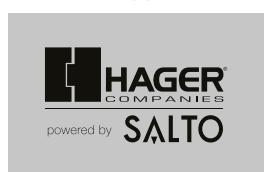
2-Color 2-Color Reversed
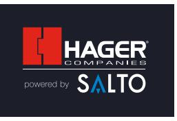
Black Reversed White
OUR COLORS DEFINE OUR BRAND.
The corporate color palette includes a red and black theme with supporting tones. Color matching standard Pantone® references are included to ensure accuracy when reproducing the palette.
Color Palette // Hager
These are our corporate primary colors for our logo, text, and headers.
pantone 485
cmyk 2 : 95 : 94 : 0 rgb 225 : 37 : 27 hex # e1251b

pantone 532 cmyk 88 : 77 : 53 : 70 rgb 28 : 31 : 42 hex # 1c1f2a
pantone Cool Gray 10 cmyk 59 : 47 : 42 : 31 rgb 99 : 101 : 105

cmyk 30 : 22 : 23 : 3 rgb 187 : 187 : 187 hex # bbbbbb
hex # 636569 pantone Cool Gray 4
HEX Values for consistency across different media. Where possible, the logo should be reproduced in the CMYK color process. Equivalent colors can be composed using the RGB and HEX references included when the logo is to be used digitally.
Also included are the references for CMYK, RGB and
Color Palette // Hager powered by SALTO
These are our Hager powered by SALTO primary colors for our logo, text, and headers.

pantone Process Blue cmyk 100 : 28 : 6 : 1 rgb 0 : 130 : 202 hex # 0082ca

pantone 0821
cmyk 55 : 0 : 8 : 0 rgb 111 : 207 : 235 hex # 6fcfeb

pantone 485 hex # e1251b
cmyk 2 : 95 : 94 : 0 rgb 225 : 37 : 27

pantone Cool Gray 1 cmyk 18 : 13 : 15 : 0 rgb 217 : 216 : 214 hex # d9d8d6
TYPOGRAPHY IS THE BACKBONE OF DESIGN, GETTING IT RIGHT IS PARAMOUNT.
Typefaces. Print.
Our corporate typeface is Montserrat. This full font family comes in a range of weights to suit a multitude of purposes. It was optimized for print, web, and mobile interfaces, and has excellent legibility characteristics in its letterforms.
Typefaces. Online.
When technology allows for it, Montserrat should be used in any web applications. The default fall-back corporate font is Calibri which should be utilized to ensure acceptable degradation when Montserrat is unavailable.
Typography. Style.
Text for correspondence and publications should preferably be set in upper and lower-case, and flush left with ragged right. Capitalization should never be used for body text, but is acceptable for headings.
Headline Fonts
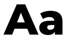
ABCDEFGHIJKLMNOPQRSTUVWXYZ abcdefghijklmnopqrstuvwxyz (.,:;?!£$&@*) 0123456789
// Extrabold
Aa
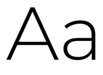
ABCDEFGHIJKLMNOPQRSTUVWXYZ abcdefghijklmnopqrstuvwxyz (.,:;?!£$&@*) 0123456789
// Bold
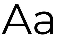
Body Copy Fonts
ABCDEFGHIJKLMNOPQRSTUVWXYZ abcdefghijklmnopqrstuvwxyz (.,:;?!£$&@*) 0123456789
// Light
ABCDEFGHIJKLMNOPQRSTUVWXYZ abcdefghijklmnopqrstuvwxyz (.,:;?!£$&@*) 0123456789
// Regular
THE CORPORATE FONTS AND TYPOGRAPHY — MARKETING USE
Typography plays an important role in communicating an overall tone and quality. Careful use of typography reinforces our personality and ensures clarity and harmony in all Hager communications. We have selected Montserrat and Calibri, which helps inject energy and enthusiasm into the entire Hager communications, as the primary and secondary corporate typefaces.
PRIMARY FONT MONTSERRAT
MONTSERRAT
Bold
ABCDEFGHIJKLM NOPQRSTUVWXYZ abcdefghijklm nopqrstuvwxyz
Regular
ABCDEFGHIJKLM NOPQRSTUVWXYZ abcdefghijklm nopqrstuvwxyz
TYPE EXAMPLES MONTSERRAT
Figures
01234567890
Special Characters
! "§$%& /()=?`;: ¡"¶¢[]|{}≠¿' «∑€® †Ω¨⁄ ø æœ@∆ºª©ƒ∂'å¥≈ç √~ µ ∞… – ≤<>≥˘› ‹◊
FONT DOWNLOAD LINK


Direct Link :
http://www.fontsquirrel.com/fonts/montserrat
<– Scan to download Montserrat
THE CORPORATE FONTS AND TYPOGRAPHY — GENERAL USE
Typography plays an important role in communicating an overall tone and quality. Careful use of typography reinforces our personality and ensures clarity and harmony in all Hager communications. We have selected Montserrat and Calibri, which helps inject energy and enthusiasm into the entire Hager communications, as the primary and secondary corporate typefaces. Calibri is a Windows standard font.
|
PRIMARY FONT
CALIBRI |
C | A | L | I | B | R | I | |||||||
|---|---|---|---|---|---|---|---|---|---|---|---|---|---|---|
| Bold | A | B | C | D | E | F | G | H | I | J | K | L | M | |
| N | O | P | Q | R | S | T | U | V | W | X | Y | Z | ||
| a | b | c | d | e | f | g | h | i | j | k | l | m | ||
| n | o | p | q | r | s | t | u | v | w | x | y | z | ||
| Regular | A | B | C | D | E | F | G | H | I | J | K | L | M | |
| N | O | P | Q | R | S | T | U | V | W | X | Y | Z | ||
| a | b | c | d | e | f | g | h | i | j | k | l | m | ||
| n | o | p | q | r | s | t | u | v | w | x | y | z | ||
| TYPE EXAMPLES | Figures | 0 | 1 | 2 | 3 | 4 | 5 | 6 | 7 | 8 | 9 | 0 | ||
| CALIBRI |
Special
Characters |
! | " | § | $ | % | & | / | ( | ) | = | ? |
`
; |
: |
| ¡ | " | ¶ | ¢ | [ | ] | | | { | } | ≠ | ¿ | ' | |||
| « | ∑ | € | ® | † | Ω | ¨ | ⁄ | ø | π | • | ± | ' | ||
| æ | œ | @ | ∆ | º | ª | © | ƒ | ∂ |
'
å |
¥ | ≈ | ç | ||
| √ | ~ | µ | ∞ | … | – | ≤ | < | > | ≥ |
˘
› |
‹ | ◊ |
BRINGING INTEGRITY, VALUE AND SUPERIOR SERVICE TO EVERY CUSTOMER.
Hager Companies is an independent, 6th generation family-owned door hardware and electronic access control company that is committed to providing a level of integrity and customer service uncommon in the industry. We strive to be a trusted partner to our distributors and contributor to their success, ultimately elevating the value our distributors bring to the channel.
Hager's legacy of offering quality products and superior customer service, collaborative partnerships with all channel partners, and its ability to consolidate and simplify the process — from specification writing, estimating, ordering, delivery and invoicing — allow us to evolve and meet marketplace demands.
CONTACT
For further information:
Hager Marketing E: marketing@hagerco.com P: (314) 633-2757

